Makeovers made simple: 5 simple ways to make your financial dashboards sexy
Finance can be elevated by having the right analysis presented in a digestible format, says Richard Sampson, SVP EMEA, of ERP reporting vendor insightsoftware.
Finance can be elevated by having the right analysis presented in a digestible format, says Richard Sampson, SVP EMEA, of ERP reporting vendor insightsoftware.
Graphs, tables, and spreadsheets are not things you would ordinarily call “sexy.” For the finance team, they are the building blocks of their day-to-day working lives.
Without them, reporting accurately and efficiently simply cannot be done. Often, they are labelled as a “necessity,” rather than anything else.
However, as technology advances, these graphs, tables, and spreadsheets are getting a re-vamp, but not the “bells and whistles” type of makeover you may think. We are not talking about animation and 3D rendered pie charts. Instead, simplicity combined with interactivity is at the foundation of the makeover.
Let’s face it: Simplicity is favoured by philosophers. Occam’s razor states a solution that requires the least speculation is usually better. It is a problem-solving principle that reflects why simplicity can often be the way forward when faced with many competing hypotheses.
In the case of effective financial reporting, which can involve many routes to successful analysis and decision-making, getting to the result requires something simple, quick and efficient—and that simplicity certainly has a dose of the remarkable about it.
Consequently, according to Gartner, 59% of CFOs identify supporting analysis and decision-making as the top business processes that need investment.
We decided to organise the most popular dashboards available to CFOs today for board level reporting, with simplicity at the heart of their make-up. Following extensive conversations with our financial users, these are categorised as the top five most simple and sexy ways to see strategic finance data in action.
These reflect the modern finance team of today, enabling them to make the transition from the Department of Finance to the Department of Management.
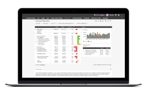
Having spoken to our CFO user base, one of the things they appreciate the most is the ability to inject some interactivity into the traditional Financial Statement template.
Taking a standard Financial Statement and overlaying it with multi-dimensional hierarchies makes it easy to perform quick and intuitive analysis on the fly.
The design of the template is the sexier part, though. It allows for ad hoc guided analysis by drilling down multiple dimensions or simply switching between Actual versus Budget or Forecast or Periodic versus YTD data.
It may not sound like much, but try to do those types of drill-downs with a generic business intelligence (BI) tool, and a business will encounter many inaccuracies and limitations. Generic BI tools are not typically able to handle multi-dimensional data structures of enterprise performance management (EPM/CPM) systems.
This is why it is the most popular visual dashboard used by our customers.

Excel is probably the best product Microsoft has ever released. It is safe to say that there is not a finance team in the world that does not use it in some form. A finance team loves a decent, solid table!
So, when it comes to distributing financial information over the web, with a hat tip to Excel, the multi-column table, with its drill-down capabilities, is often the go to visualisation.
Multi-column tables are used for pretty much anything you can think of: Profit & Loss, Balance Sheets, KPI overviews. . . the list goes on.
The hidden secret of a multi-column table is rooted in its Excel-like representation from a user experience perspective, offering a high level of flexibility in customising and formatting rows, columns, and numbers for a C-level audience, all centrally managed through the web.
Our customer base ranks these as their second favourite template available to them for this reason.
How many bars can you pull together to show you the trend or development of an account over time?
Common bar graph representations in many tools are limited in the sense they do not give you the ability to see multiple accounts together in one single view.
Well, now many bars and lines can be consolidated to identify what in the past would have been hidden patterns in your data. The Multiples Bars & Lines chart is a template to show trends when combining accounts, members, and dimensions. Through mixing line charts and bar charts, a finance team is able to display up to six axis frames in one report that can be easily adjusted to expand, focus, or shift the analysis.
It is fast becoming one of the most popular reports used by our financial users.
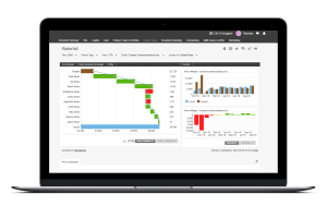
Bridge, waterfall, or cascading graphs are hugely favoured by our customer base, especially for Management reporting. They offer a very intuitive and easy-to-process view of the “movement” in a scenario which spreads across multiple dimensions.
For example, a typical application would be visualising the impact on the difference between budgeted and actual gross margins over a certain period, split across the regions a business is active in.
Our CFO customer base loves this type of visualisation as it offers a clear, intuitive way to share complex financial information with their C-level colleagues.
5: The hidden value in a Value Tree template
What is a Value Tree report, I hear you ask?
It is a simple way of making accounts digestible for non-financial users. It is used for reports that give insight into the composition of an account, KPI, or another dimension.
Hypothetically, if you need to show a simple visualisation of Profit, articulating the impact of cost structures on Net Profit, then a simple dashboard can convey it, while also linking to the drivers influencing the calculations, should someone want to explore the detail.
If a finance team needs to explain and articulate a standpoint to someone who is not in the field, this type of template earns top points for communicating a message. The coloured formatting options and accessible “tree-like” structure also makes things easier to understand.
And it’s not just reporting that is evolving. The finance team itself is undergoing a makeover.
All of the most effective ways to visualise your various accounts, scenarios, and KPIs are not necessarily “fancy,” with a lot of bells and whistles attached. However, they enable CFOs to tell what would otherwise be a very complicated story quickly and extremely effectively.
Combine that with the ability to access data in real-time and to interrogate it on the fly and quickly you find that these visualisations become extremely sexy and enticing .
The monthly Board meeting is elevated to a new level. Stakeholders can analyse the business via a personalised iPad display, showing them individual focus areas. Gone are the days of printing off a hefty Board pack.
The modern finance team relies heavily on the right analysis to make significant business decisions on a daily basis. Having the right analysis presented in the right way, in a digestible format, with the latest numbers, are the building blocks to elevating the Department of Finance to the Department of Management.